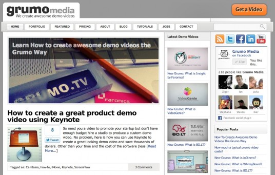
Summer is here and Grumo welcomes the new warm and sunny season with a slightly new look for our website.
Basically, there are have been 4 minor changes. Take a look:

Can you guess what are the changes? Here they are:
- Logo changed: instead ot having “Grumo Media” in plain text, we used a cooler font and made it look more professional yet still fun by using a slightly cartoonish font.
- Get a Video Button: the old button was cute and cartoonish too but did not fit with the new look any more so we changed it to a slicker more 3D-ish button.
- Background: the background had a generic seamless dark texture that was getting old so we changed it to a solid grey color which gives the page a more timeless look
- Rotating Banner: We added a big fancy image banner to promote popular posts and new offerings like the Grumo Course.
Websites are like homes or clothes, to stay hip and fun is necessary to change the look every so often.
I hope you like the new changes!
Cheers!
Grumo Team
PS: Here is the slider again, boom! so easy to put anywhere!
[promoslider post_type=”promotion” category=”my_category” display_title=”default” numberposts=”2″ ]
Get Our Top 10 Video Marketing Tips
Enter your email below to receive the exact strategies we've used to reach over 20,000,000 people with our videos without spending a single dollar in ads
appreciate your desire for the redesign – I did that recently too.
Too bad you don’t have that funny avatar in your banner – that is so awesome and would add SOO much flair to the site. Don’t make it look too corporate 😉
Thanks Mars. Yes, I’m planning to put back the Grumo avatar.. I am just thinking where.. by the logo or pointing at the Get A Video button?
Mr GRR is coming back one way or another!